Like any report, this is just a synopsis of what we’re seeing in logo design. You should use this information to build on and push design forward to the next level. It’s about evolving forward, not repeating where we’ve been.
Shadow Breaks
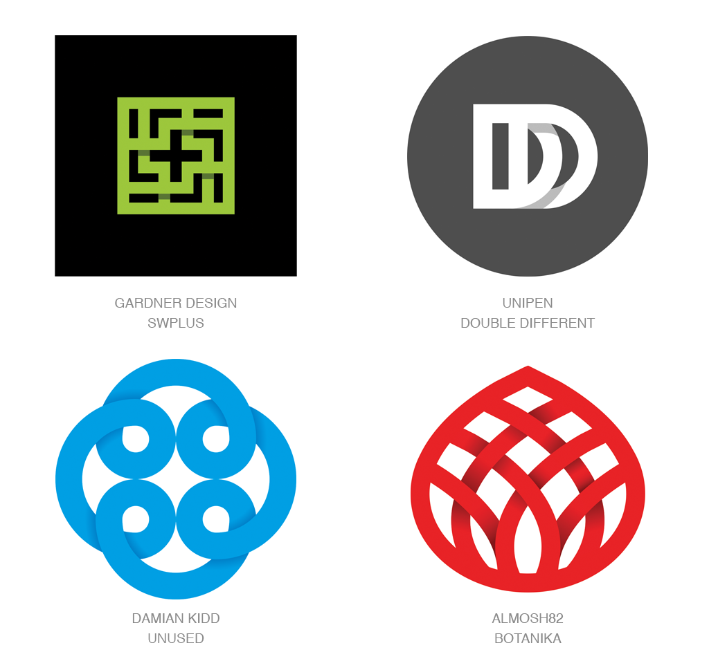
Even when limited to the claustrophobic confines of a two-dimensional page, turning potential reality into graphic representation has never been insurmountable by a crafty pack of designers. Over the years, the traditional and signature move of any designer worth their salt has been to create a line-break when one element briefly passes beneath another. Excising a clean piece of a line from the mark just before it passed beneath another gave a visual signal of layers intermingling without one layer merging into another. And despite the appearance of this in a portfolio signaling a designer’s coming of age, replacing the gaping hole with an abrupt shadow is a much more normal course of action.
These Shadow Breaks are generally managed without slow gradation. A flat tone, a step or two deeper in value achieves everything a line break could but moves a mark one step closer to a natural representation and not just a symbolic representation of dimensional layering. This technique demands an additional tone as opposed to flat color, but that’s seldom a deal killer. I can’t imagine line breaks are ready to shuffle off the mortal design coil, but at least this fresh way of expressing hierarchy of levels will allow us to mix it up a bit. Shaking up the status quo is always worth a second consumer glance.
Fades
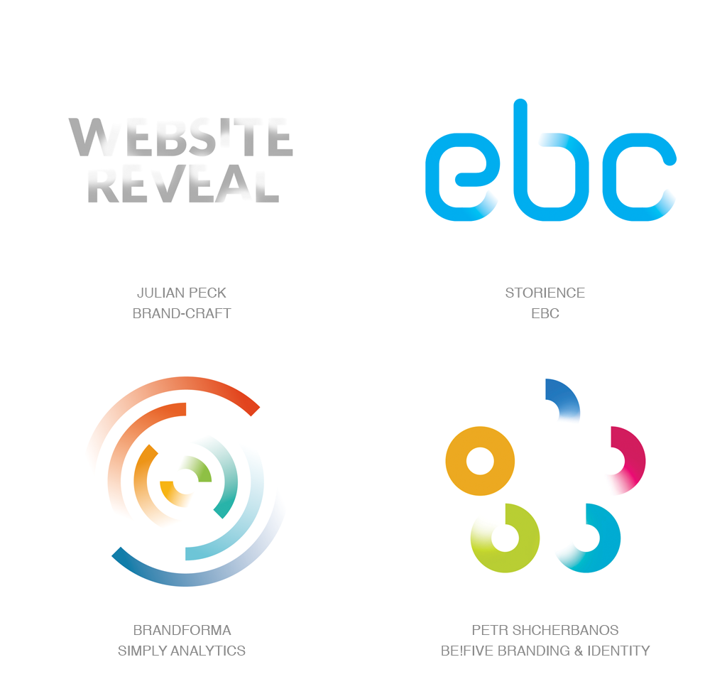
Watch these marks, as they seem to rise out of a deep fog to expose themselves to the public. Whether in the process of coming or going, the viewer can be assured there is transition afoot. These marks are defined by gradient that takes an image and slowly allows it to sink into the page as it brakes from 100 to zero. Though it’s easy to imagine these living against a black or colored background, there is a freshness that seems to make white the field of choice. This lightness signals new beginnings and virgin opportunities and offers up an ideal sense of place.
These gradual fades only work if the designer is willing to reveal enough of the design bones to allow the consumer to complete the missing picture. This mark for Be! Five Branding, composed of a series of five sequentially vanishing circles, works because even the quarter circle alludes to enough of its former self. Even letterforms let themselves get caught early enough in a vanishing act to be fully identified. I note the circular marks remind me a bit of the “loading” animations that rotate onscreen. Not sure that’s a smart device to associate with an identity. My encounters with these usually leave me wondering if I’m committed enough to the promised forthcoming content to stick it out or click off.
Rising Color
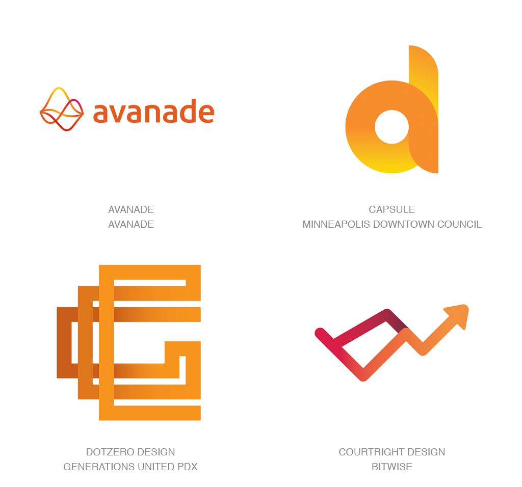
This wraps up our third trend that is actually more technical in nature as opposed to form in orientation. Rising color is a subtle approach to the separation of layers or depth in a logo. A mark generally lives on a flat plane, so any inference of depth or dimension has to choose early on if it’s leaning towards realism or symbolism. If this trend had to choose, it would probably set up camp toward the realism side, but since it lacks shadow and highlight, it may fall closer to the middle.
The premise here is to build a surface gradation that follows a pathway through a mark so that any linear or shape crossing over itself is evident by a shift of color intensity from the area it overlaps. Though this is rife with possibilities for linear marks, it doesn’t have to reside there. The mark for Minneapolis Downtown Council starts with a deep blush of color in the lower right, and as it loops around like an off-ramp, it’s able to project under and upward without shadows or line-breaks for separation. Obviously, you won’t pull this off without the use of halftone, but that consideration in a mark seems to be losing the tug-of-war with such a high percentage of clients living in an RGB world.
Simplicity

As a continuing homage to a Spartan lifestyle and not candy-coating our words, form in logo design is wearing the simplicity moniker like a badge of honor. These marks remind me a bit of natural food products that suggest you best avoid ingredients you can’t pronounce. If the building components of a mark don’t look like they belong in a set of play-blocks, you may be busted. Though many of these look like a throwback to the 60’s and 70’s, the more mature color palettes and application of attending visual brand language assure us they’re tomorrow’s generation. Color is still clean but usually tweaked to avoid the primary juvenile aesthetic.
Shapes are usually standalone but always compound with others to tell the story. If your parts require much more than a right angle and an arc or two, you probably aren’t going to fit in this genre. Like the Colorforms, Legos, or blocks of your youth, the juxtaposition or arrangements of three or four elements can become infinite. Note the logo for Love Cinema. Fashioned from a heart, a box, and two circles, it could be reconfigured for hours before someone would arrive at this arrangement with such evident symbolism. A client trying to express an unencumbered aesthetic could do much worse.
Simple Overlays
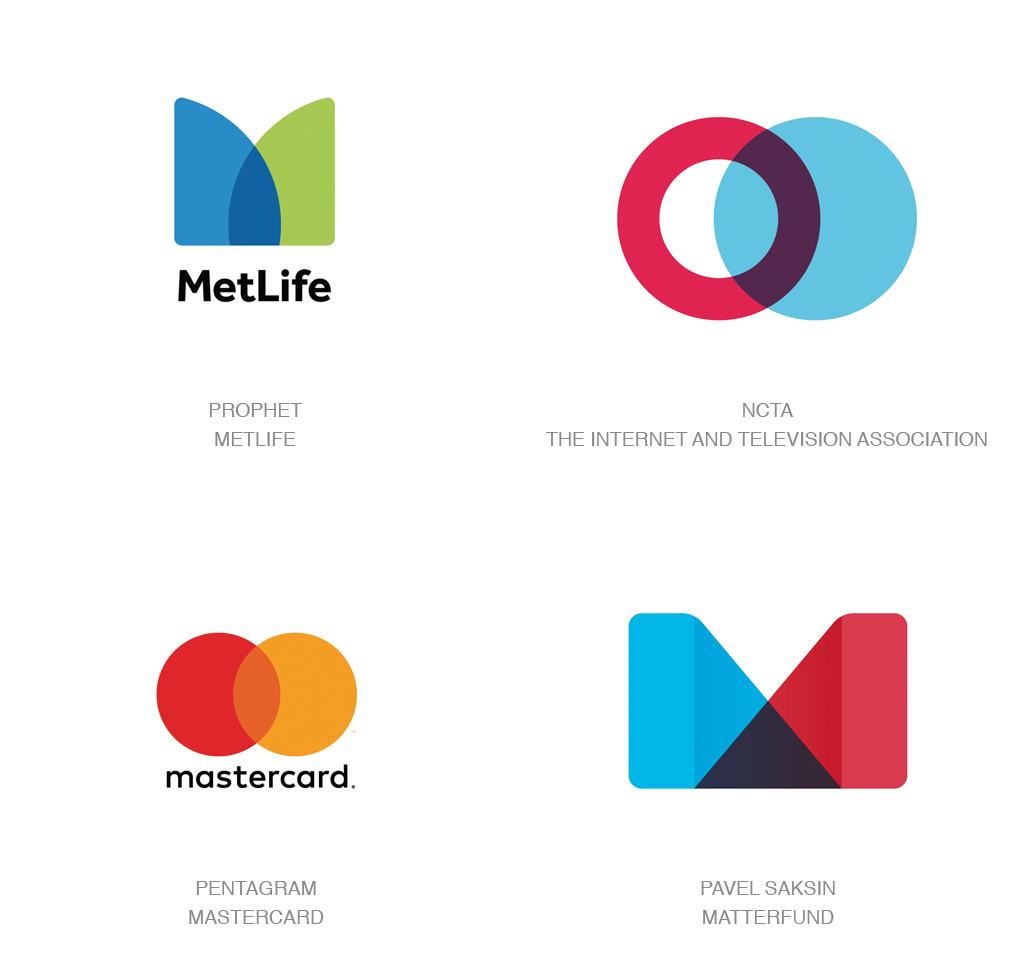
Pairing the austere aesthetic of the previous category with the unencumbered clarity of simple transparency creates a message as evident as its construction. These logos cast aside any pretense of overachievement and completely rely on a simple geometric message: Embellished forms need not apply. This trend relies on two elements creating the purest of intersections with a formula of one plus one equals new. MetLife’s two quarter-rounds obviously create a mnemonic M but also suggest strength where the twain meet.
Transparency has become a standard in the identity canon with a diverse array of applications and styles. One of the primary attributes is to convey the open nature of the company, organization or practices it represents. Often affiliated with entities in the financial field, transparency shows consumers their investment is open to inspection, and the process is not cloaked from the public. Pentagram brought MasterCard back to this genre with a smart clean version of the classic Venn diagram in brilliant orange where the red and yellow hemispheres of the world meet. If there is a challenge with this trend, it may be that a reliance on two pieces of simple geometry means we’ll run out of good building materials soon, so let’s hope an affinity for this trend also includes a plan to evolve it forward.
MultiCentric
Unless we’re talking to flat-Earth folk, a few parallel stripes circumscribing the globe are basically concentric circles. This year, we’re talking stripes, so it’s only natural we’re knee-deep in plenty of logos with round stripes, and particularly the idea of multiple series of these intentionally overlapping. Pebbles dropped in the water, radiowaves, WiFi, heat, good karma. Think about what radiates, and if this fits the objectives of your clients, this may be a good candidate to consider. The true heart of this trend is the impact of multiples on each other.
Lance Wayman might be proud, as there’s a streak of his ’68 Mexico City Olympic design reflected in this neo-revival. The cadence of positive to negative space varies broadly amongst these. Some solutions appear more monoline in aesthetic, and other circles are fat enough that there’s no good room for negative space in the design. Of the group of MultiCentric marks exhibited here, it’s worth noting there is not a complete circle in any of the designs. Not that it’s imperative to the trend, but it speaks to the inventive nature of the designers that circles are only inferred by a series of overlapping or disconnected arcs.
Ellipses
Each year provides us with a glimpse at what digital symbolism has entered into the general public’s vernacular. It’s somewhat comforting that ellipse – or as I grew up referring to them, the “etcetera dots” – are reintroducing themselves. Better known in tech jargon as Read Receipts or Typing Awareness Indicators, these three specks command a new level of respect. Society now sees grown individuals fixated on, teens obsessed with, and relationship counselors profiting from those mighty pulsating dots. Inserting in a flag may well indicate a political dialogue while I note the single bubble in Discussion Records looks to be more of a monologue than a discussion.
At one time, these dots were a great shortcut for lazy writers that didn’t have the inclination to finish a list. However, in 2005, Blackberry introduced ellipses to their interface, and iPhone followed suit two years later. As a result, in logo parlance as in conversation, they now show that you have something of note to say. You are holding the floor while others await your words with riveted anticipation. Though keeping the symbol encased in a speech bubble gives the dots a sense of place, we can only imagine they’ve reached the age of consent and could stand on their own, bubbles or not.
Text Boxes
Personally, I think a beautiful wordmark is the epitome of clarity and functionality. Too often, it seems the pure text solution suffers a bit of an inferiority complex in comparison to its sibling, the graphic logo. It’s just this insecurity that often leaves a typographic solution needlessly busting every move it can to be more competitive. How does type assure itself it will be recognized as a logo and not just another piece of text on the page? In the continuing appropriation of digital devices, the lowly text highlight box resurfaces to underscore the importance of “so much type. ” Imagine drawing your cursor over a sentence and seeing a graphic text box encompassing your selection. That’s where the eye is directed as the highlight enunciates, “this is the important part. ”
Appropriated from broader industry use, the highlighted artifact has found its place behind headlines on Bloomberg or Fast Company online to allow text to float over a photo or graphic. It now finds itself serving as more than just a box but with greater importance. From an identity standpoint, this lends itself to a technical personality or finds itself equally comfortable when a client is dealing in language or words as its trade. Here it frames out a name like Mozilla, the free software community. A mark that could well have stood on it’s own but that with the encapsulating box gives viewers a trigger to help them visualize this word on their screens.
Yin Yang
As happens from time to time, resurgence in the popularity of a motif will resurface with a vengeance. But seldom does that happen with one that dates back 3,500 years. That’s the first noted record of the Yin Yang symbol that’s received a bit of a lift with the discussion of multiculturalism in the west. Yang – the lighter side, represents the positive, active male, and Yin – the dark half – represents the negative, passive, and female. Sounds like a pretty misogynistic perspective for such an enlightening symbol. The concept of bringing opposites or conflicting agents together to create a greater strength is as old a tale as the mark.
Hot and cold, sweet and sour, pricey and cheap, reflective and aggressive, or you pick your own counter-traits of your client. This may be the way to best exemplify the divergent advantage they create. From a graphic perspective, the reflective nature of this mark is pleasant, self-contained, and allows great latitude for interpretation. Fitting in a circle is a nice plus, but feel free to explore other shapes and iterations that still convey the essence. Bringing diversity into a state of oneness is older than the Yin Yang and as relevant as today.
Pasta Bends

Virtual reality has taken off, and the race to create the best mind-blowing experience without leaving a tether is on. More than a few VR addicts have found themselves leaving their basements, sporting an obligatory Oculus hickey across their nose. That amount of enthusiasm still peaks the ire of designers long feeling their designs are destined to the flat world with lift-off relegated to the occasional crystal cap effect or highlight ping. What designers do know is that the public can be lured by the mere suggestion of 3D. That gauntlet cast before us, we are seeing more attempts than ever to jailbreak the surface of the screen.
This group of marks has pushed beyond the flimsy film-like twisted ephemeral shards of the past. They’ve put on the pounds and bulked up to flex their muscle even if it doesn’t look much thicker than a piece of al dente pasta. Chances are none of these will vanish when they turn sideways. Their profile shapes could be enough to convey a visual message, but by crafting a three-dimensional form out of these, they take on a personality and life that so many two-dimensional logos could just envy.
Utilizing strong shadow and highlight with gradation, these complex marks have some of the qualities of a popular pet toy. Pasta Bends need to fit with the client’s personality, so give strong consideration to compatibility. Anticipate seeing this trend expand as there is much room to be explored, and dimension is on the rise.
Wrapped
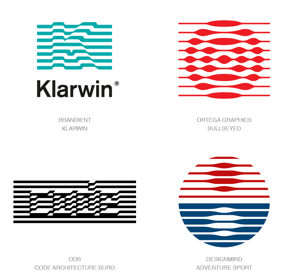
Obfuscation of the premise of your logo is tantamount to talking to someone in a whisper. Done at just the right tone, it’s a sure way to quiet a crowd and guarantee their opportunity to eavesdrop. A bit like a puzzle or guessing game, these marks appear as if someone draped a striped bed sheet over the entity’s product to hint at but not fully disclose their undertaking. Taken another way, the buried image could indicate part of the process that defines the product.
Keep in mind the sample identities here utilize stripes of various iterations, but there’s no reason the same effect couldn’t be achieved with distortion in any pattern: a good grid, a plaid, water surface, bark on a tree, or any pattern that has a regular nature that seems to be resting over a fundamental representation of a firm’s endeavor.
Klarwin, an emerging technology firm dealing with filtration, defines its product with a K that looks like it’s having a challenge passing through the filter. Code Architecture gives a sense of structures rising under the precise topographical grid of a community. It’s the undercurrent that’s always stronger than it looks, and this may be the way to deliver that message.
MicroLines
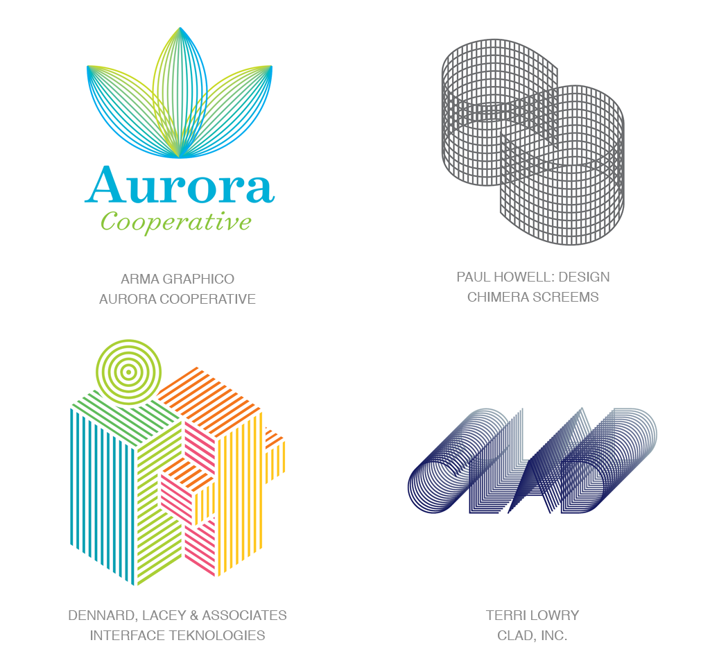
Going against every rule of smart identity design, this works. We’ve been admonished time and again that too fine of a line will not scale down well. Allowing line work to run together will create a printing nightmare. And don’t go for a swim for a half-hour after you’ve eaten. I’m here to say this trend dispels at least two-thirds of those warnings.
Banking on the public’s familiarity with wireframe design may be the influence behind these logos. With the advances in 3D modeling and printers, or “additive manufacturing” as the industry prefers, consumers are becoming conversant with the linear mesh geometry that defines an item to be printed. It is the shorthand vector language that defines even the most curvaceous of items, whether it’s to be fabricated or animated.
The unexpected nuance of this trend is the linear surface for all intents serves as a halftone effect or a printing screen. Where lines come together, the color becomes more intense. As lines compound at an angle or in a curve, it darkens in shadow. One of the upsides to this genre is it conveys a technical essence and demonstrates precision of process. The open grid work also allows for the mark to tie to the field and integrates the marks to the page or the screen. Scale can definitely fight these marks, but managed properly, it may be worth breaking a rule or two.
Doubles
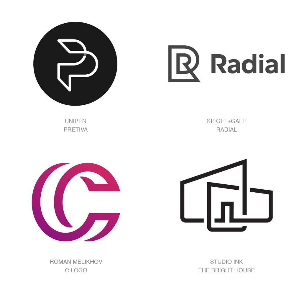
In a marriage of several past trends, the idea of Links, Simplicity, and Monoline all converge for a plethora of marks that we’ll refer to as Doubles. Obviously, Doubles earns its moniker because each of these brings together exactly two items in a knot or a weave of a continuous line. Or, it could be a single item split into two sections. Since initials or acronyms are such a target-rich resource of symbolism, it’s no surprise to see this trend saturated with letterforms. The mark for Pertiva is about as basic as these get as it takes on an extruded form, but note that the other examples are linked inside, outside, woven between, and twisted around.
Bright House plays out structures and a foreshortened perspective to create a bit of dimension as well. Line breaks, shadow breaks, and no breaks at all are in play here, but the linkage aspect of these is undeniable. Bringing two elements or concepts together with this simple language can signify strength of unity or compounding of capabilities or concepts. Connecting disparate thought or kindred ideas both work well here. It might also be worth noting that the strokes on these and other marks in the monoline aesthetic are starting to put on a bit of weight. Maybe a sign of evolution of the linear trend, or it could just be our eyesight is getting worse, and designers are learning to fatten the stroke or die.
Wings
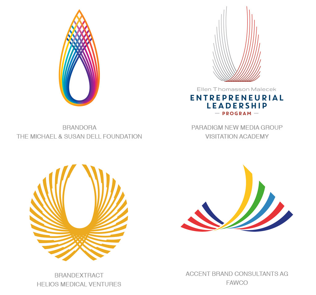
This trend caught me a bit off-guard based on the number of designers that landed on this idea without an evident epicenter logo causing the anomaly. It may well have been a natural migration from the bars or stripes so prevalent in this year’s design vernacular. Imagine lifting the opposite ends of a series of lines upward in an aspirational motif. These lines take on an ethereal wing-like quality with a certain symmetry that evokes nature or the natural vanes of a feather. The airy quality of any of these allows the environment to shine through the mark. It’s just that gravity-defying quality that makes this trend so engaging.
Individual lines express a tension that gives the appearance they are taught and ready to spring forward or lift into the air if released. The logo for Dell Young Leaders is reminiscent of a flame as well as a pair of extended wings and a woven aspect as well. There’s a great deal of symbolism here for such tight quarters. The active nature of these marks can represent an entity in motion with many parts coming together to allow it to launch.
Color Split
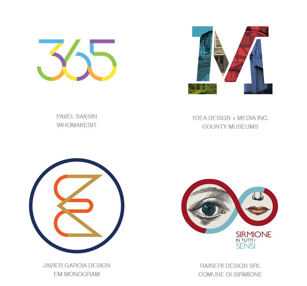
Besides being a great place for birds to perch, there’s just not a lot of space to do much of anything on a line. Maybe this is one of the reasons the monoline aesthetic has been so bereft of color. In an attempt to employ lifesaving techniques or to keep pushing evolution of the trend forward, designers have again discovered a way. By dissecting line work via color splits, new symbolism can rise from the mark to tell a deeper story. And sometimes it appears to be just another attempt at decoration.
In the creation of the companion G logo in 2015, Google quartered the letter and attributed each section to one of the company’s signature colors. Though the stroke was pretty fat, there it is the most likely influencer for the rash of color-split monoline marks we’ve seen. The bird logo here is actually a monogram of the initials E and M and the mark for Simione in Tutti Sensi allows the blue line segment to create the initial S. I note the letter M is a bit outside this trend but included here because the designer elected to not only color split but managed to even work halftone information into the line.
Besides serving as a clever way to extract additional visuals from a line, the color breaks can help a logo express diversity or elements coming together to achieve a greater goal. It’s a bold enough motif that using it purely for its decorative nature won’t be nearly as successful as the succinct or ah ha! moment message.