Drawing from a year of observation, an overall thought occurred to me: KISS is making a comeback. Not that KISS. Sorry fans. KISS as in Keep It Simple Stupid. Designers are paying heed to the old saying and rebelling against complexity. Simplicity is king once again.
Typography has taken a decidedly strong swing to the austere. Nearly a neo-Swiss style, many wordmarks have abandoned much of their personality and adopted a universal sans-serif construction. I say neo because with every incarnation of a style there are shifts from its former self.
Notice also the simplicity of shape. Pure geometry is much more evident as foundation components in logos. As we’ll investigate, the circle has never been more central to design and in such a stripped down motif. Center stage without the wardrobe. These pared down planes are popping up across the board. More and more companies are electing to go, or following their designers, down this road. One conclusion we might draw is that a simplistic logo represents a company whose products or services are perhaps uncomplicated and speak for themselves.
Ombré
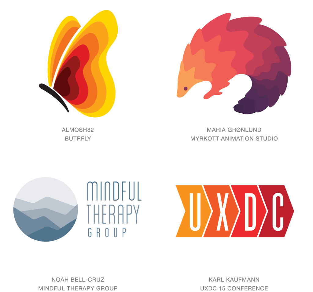
At a distance these marks may give the impression of gradient ebbing from one color to the next, but by creating a series of stepped increments, designers are cheating the system. For years the specter of creating a logo that demanded a four-color process was verboten. Sheens and gradations that once caused reproduction costs to escalate were overcome by changes in technology and the noise of the naysayers diminished. That challenge settled, designs now achieve this ombré effect by completing color transitions one step at a time. It’s a signature effect and one that a clever designer can pull off with no more than a couple of spot colors.
Sequential color breaks on these marks usually serve an additional purpose to help define edges or give dimension in a subtle, less jarring manor. Conceptually, this technique can convey the idea of a controlled shift or a multi-phase solution. It’s a gentle but evident path from point A to point B, and with inventive application introduces texture and pattern to achieve this. And if that’s not enough, for anyone who has ever designed using a traditional gradient and then cursed the challenges of reproduction with embroidery, this may be the unexpected bonus and cure to your dilemma.
Circles
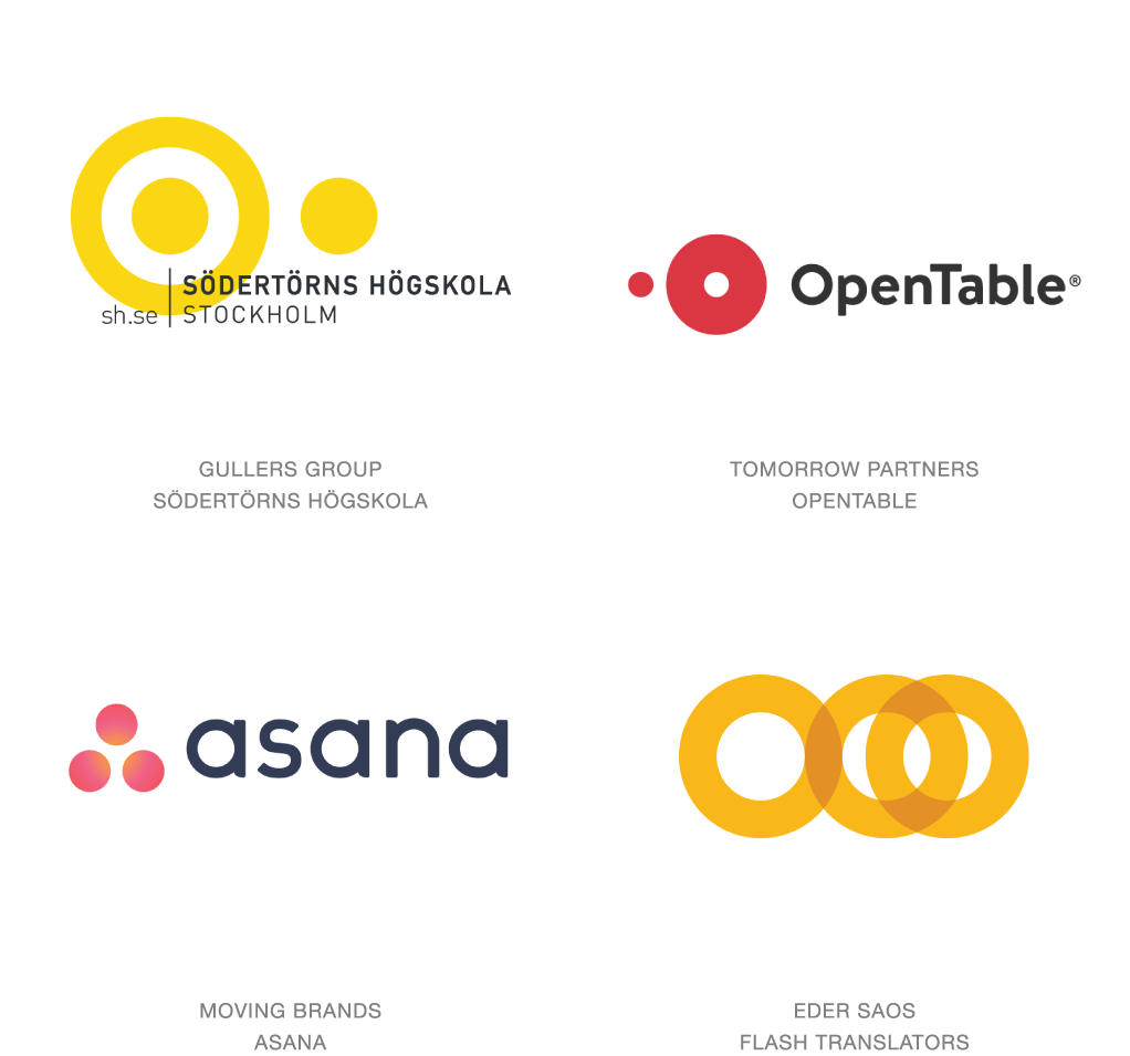
That ubiquitous icon of perfection and infinite symbolism has become a raging shape du jour. Designers wanting to define a concept have glommed onto this element as the universal visual placeholder in an effort to make the challenge as simple as pie. (Which is also round.) In the last two years we’ve seen USA Today and The Art Center adopt unadulterated circles as their logos. And these are by no means the first or the last. This trend is much broader and is inclusive of endless simple iterations of circles upon circles upon circles. Imagine you’re asked to explain a concept using only circles and you’ve captured the spirit of these solutions.
Strongly diverse logos may range from one to dozens of circles but clever solutions keep them to a minimum. In this year’s trends we have seen a definitive embrace of simplicity. The simpler the geometry the better. The differentiating element is often the surface effect that can shift from flat to transparent to gradation, but seldom to dimensional. Open Table knocks a hole in the tabletop to create the mnemonic letter O and then shifts said hole to the left to represent the diner. Asana, the app for tracking teamwork, has taken the three identity dots previously sitting in a row like benchwarmers and inserted them in the game, relating as a team member might.
Half and Half
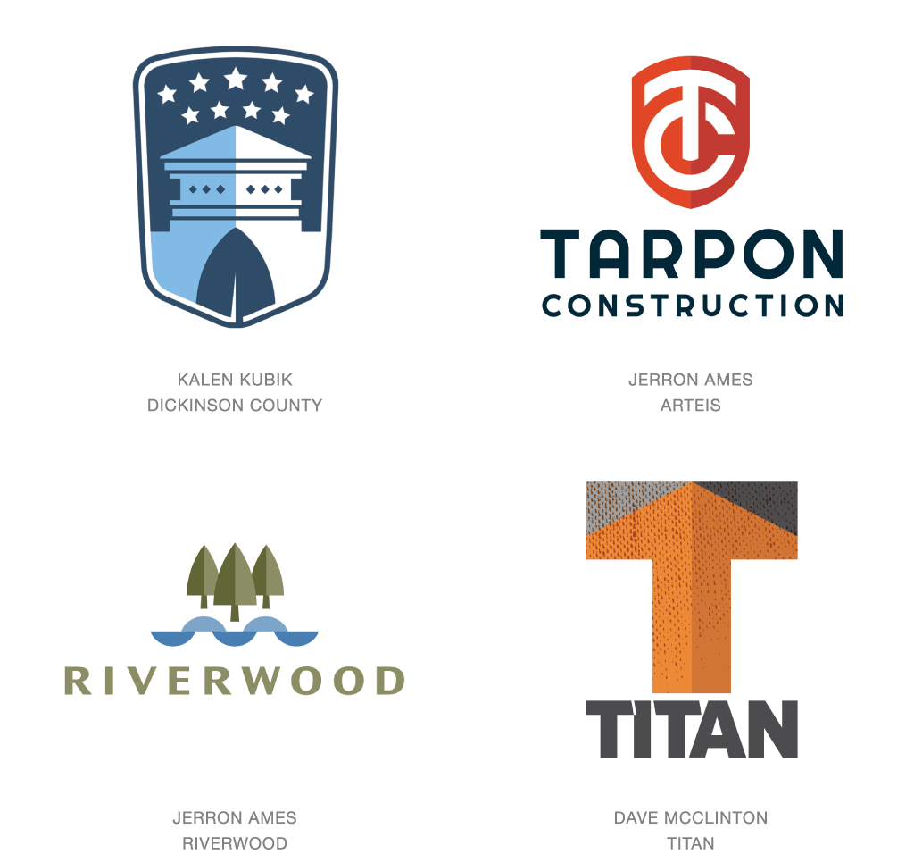
Even a designer resigned to using flat tone can still lift a logo off the page. Split the center and dial up the light to one side or the other. A dynamic corner perspective nearly always trumps a head-on view, but the tone-on-tone divide delivers interest. Don’t think of this as an iteration of the positive-negative split that generally creates a high contrast break and is seldom used to imply volume. This trick has turned into the symbolic three-dimensional shortcut of choice. Without doubt the hardline value-shift breaks up surface tension and adds a modicum of interest where there was none.
No one is looking to be fooled by this faux effect, but it rides the coat tails of more realistic dimensional attempts that have become popular over the last decade. If anything, this is a more mature way to fess up to consumers that the reality eye candy was just that and we can still insinuate mass with simple flat tone. Shield- and crest-based marks have become natural candidates for a bit of this half and half chicanery. A bit of old school heritage has been given a contemporary pedigree and is a pleasure to work with for reproduction.
Linked
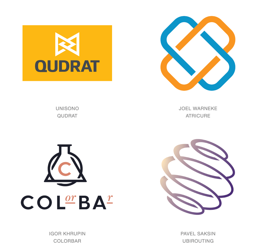
You’re only as strong as your weakest link. Or, the weakest link in a chain is the strongest, because only it can break the chain. Both great perspectives depending on which link you are. The concept of linkage is packed with metaphors and similes, but they generally come down to pairing one with others to expand capabilities. It demonstrates a commitment to another and a commitment to a cause, and though breaking bondage is an entirely different proposition, these marks are built around the strength of union.
Merging entities looking to rebrand or divergent technologies united to describe a new niche are two scenarios that exemplify linkage. But despite the absence of visual chains in its logo, LinkedIn has probably been the most evident proponent of the concept. Think of the connectivity of social media where the specter of finding commonalities or conversing with previously unknown individuals on the far side of the Earth has become a daily occurrence. When looking at this concept visually, don’t forget that chainmail in armor is a surface of links capable of creating an impenetrable wall of protection.
Stimming
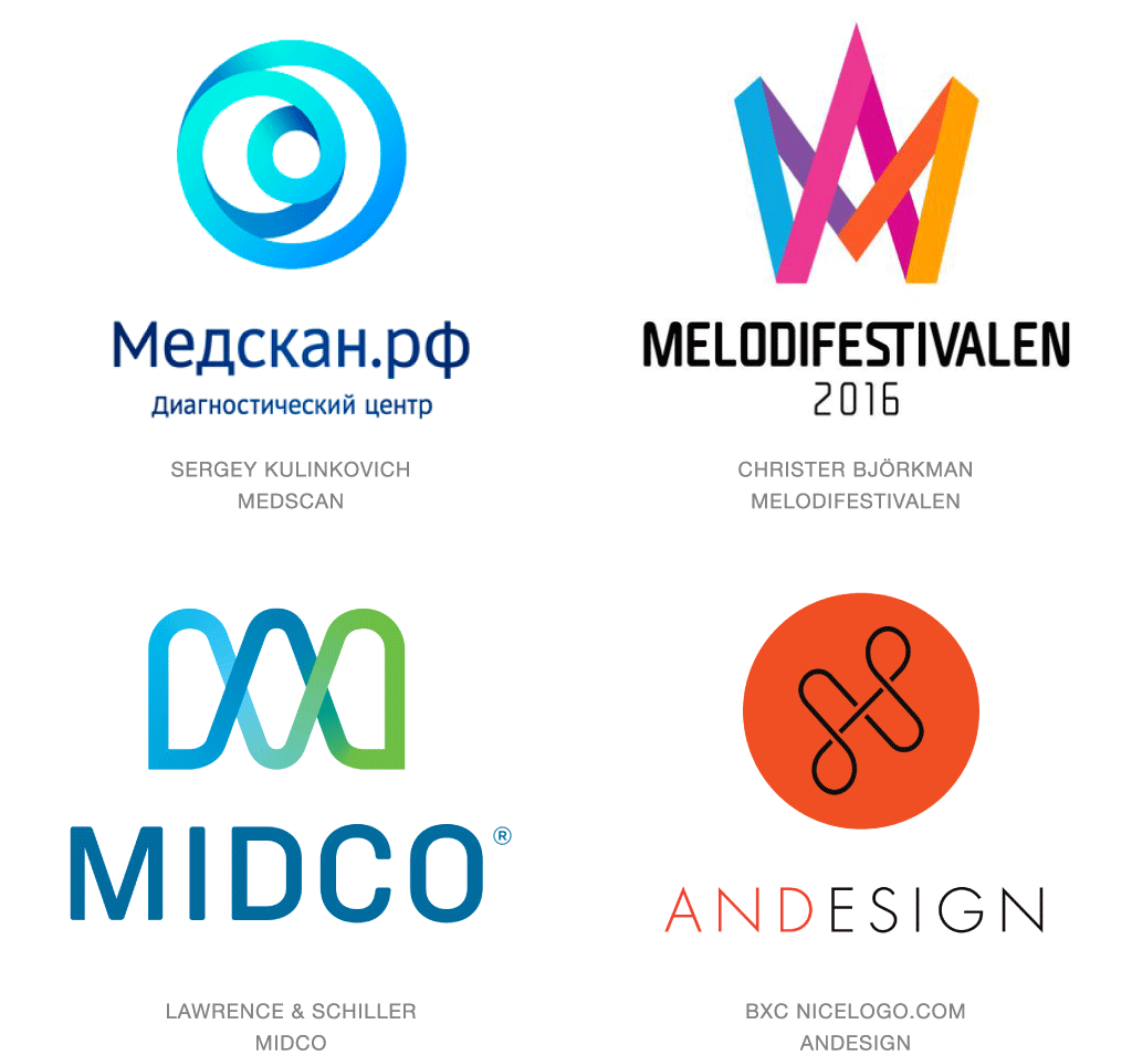
You can read clinicians who wax endlessly about individuals who subconsciously with their fingers or eyes trace figures in a never ending loop. Figure eights are common but imitating even more complex patterns will manifest as well. It’s a bit akin to a mild version of the condition “swimming,” a common habit of repetitive actions. Now consider a few of these marks by starting to trace their loop and stopping where you started, if you can stop. Mesmerizing, these logos create a continuous pathway that become both addictive and engaging at the same time.
Aside from their compulsive nature, these marks can conjure the flow or motion of travel. The smoother the radius the less jolting the ride. Imagine the value of conveying the perfection or consistency of a process. Rhythmic repetition has a captivating quality that builds momentary affinity with a consumer, which is a bonus where milliseconds of exposure count. Variants of these logos have been utilized for years but the controversial success of the AirBNB mark can take some responsibility for new interest in continuous loop marks.
Dog Eared
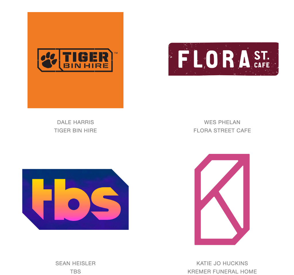
There’s a long-standing tradition of building containers. They encompass what’s important, they help protect our belongings and if you dress them up, contents that are otherwise unremarkable suddenly take on a pretty good luster. Especially when trying to lift a piece of type into the category of logo or wordmark, an enclosure of whatever shape seems to be the shorthand language to get you there. In past trend reports we have identified other trending shapes but this year the number of rectangular boxes with clipped or rounded opposite corners is truly remarkable.
Those dog-eared rectangles are actually an iteration of the hexagon that was so pervasive two years ago. It could be an artifact of that movement or it could be that the shape gives the impression of an extruded box creating a modest illusion of dimension. Or it may be that the designers couldn’t bring themselves to park another solution in an unadorned box and felt the need to dress the final product with a trim. Who’d be willing to bet that the majority of these logos make their appearance on business cards that also have had their corners sliced to match?
Corners
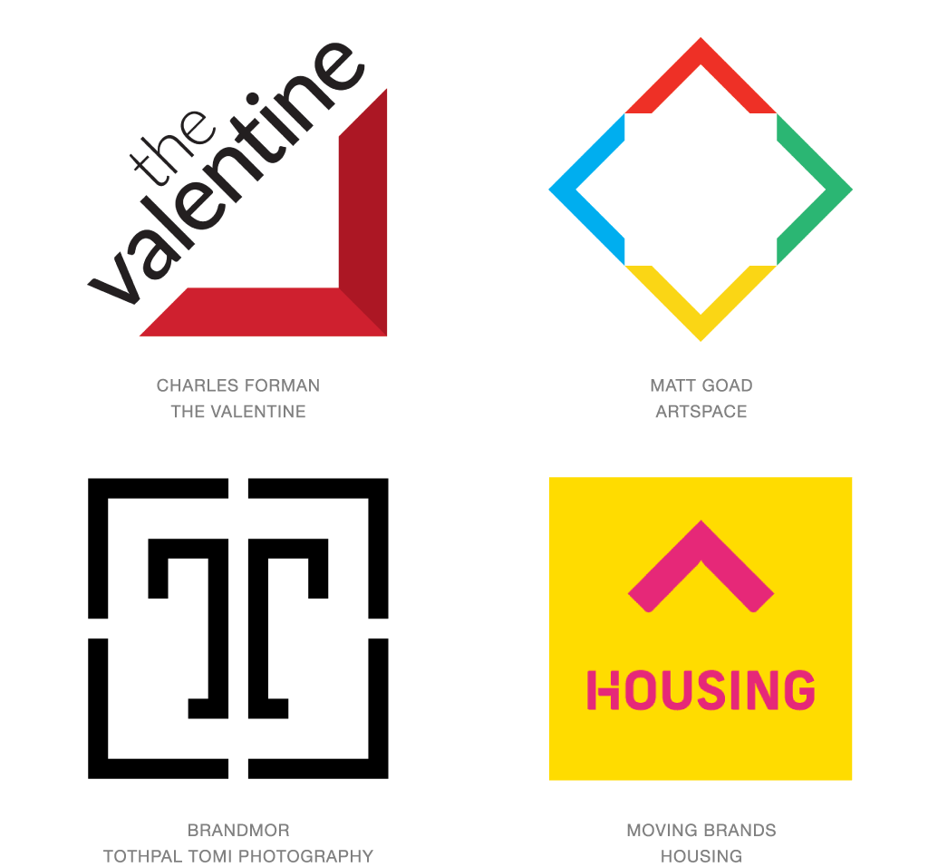
Whether describing a diminutive postage stamp or a quarter section, each has four corners. It’s a basic way of defining any rectangular space. It’s how we frame a masterpiece or the first dollar we earned. It the symbolic parenthesis we use to draw attention to what’s inside. And it’s a further signal that simplicity of mark and concept has returned. Whether mitered at the ends or square cut like the letter L, gathered in a foursome or standing alone, corners have played a central role in identity design over the last year.
Much like the penchant for circles, these right angle corners might be challenging to dress up, but they are loaded with metaphorical calories. Groupings that form a frame demonstrate an equal partnership and unified effort. As a stand-alone corner we almost assume there are three more far flung participants managing group objectives in the wings. It’s a roof, it’s a crop mark, it’s an arrow, and it’s up, down, or play depending on orientation. It’s that ubiquitous shape that can work very well or easily be lost in a crowd without strong context from color, typography or other supporting elements.
Line Dash
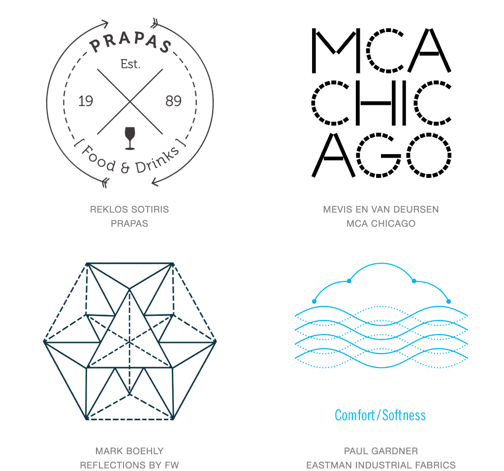
In design, the challenge with all things being equal is that all things are equal. In the evolving saga of mono-line logos you eventually reach a point where defining a hierarchy of line is valuable. That may sound challenging since the premise of mono-line design ostensibly is everything is mono or one weight. Certainly differentiation could be by color, but in a single color environment signaling variance with a dashed line seems a perfect fit and introduces some missing texture as a bonus feature.
MCA Chicago wanders into this collection with a desire to build a letterform with straight-line segments while the facets of another logo in this collection allow the dashed line to represent edges that might otherwise be obscured. Reasons for line variance are limitless but a few considerations are to demonstrate motion, borders, pathways, invisible elements, transparency, scores or secondary tiers. Scaling can dramatically impact these marks as the dash detail in a diminished size becomes a halftone line but even at that the objective of differentiation still is achieved.
Off Shift
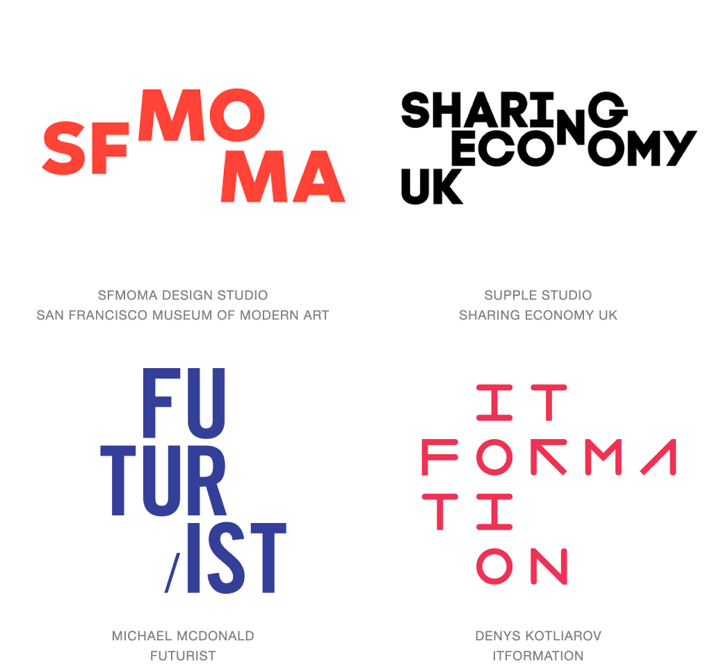
Who doesn’t love a good puzzle? Enigmatically juxtaposing letterforms is tantamount to a challenge. It’s throwing down the gauntlet and taunting the public to decode a message. There’s something about the need for order in our DNA. These marks leave us determined to straighten out or push these characters into alignment or make sense of the chaos. When the cipher’s been conquered and the consumer is awash with the glow of the “aha” moment the logos in question have admirably accomplished their objective.
Awkwardly arranging the type elements of these marks may appear as a nod to nonconformity or a way to display autonomy of various parts that come together in unity. Or it could just be with a modest shift, a vertical line of binary code appears as in the ITFormation mark or off setting the common N to manifest the point of the Sharing Economy UK logo. There is a place for the clever use of this technique but not everywhere is that place. Consider the personality of the entity in question and ask if such a challenge is in their nature and best interest.
Curls
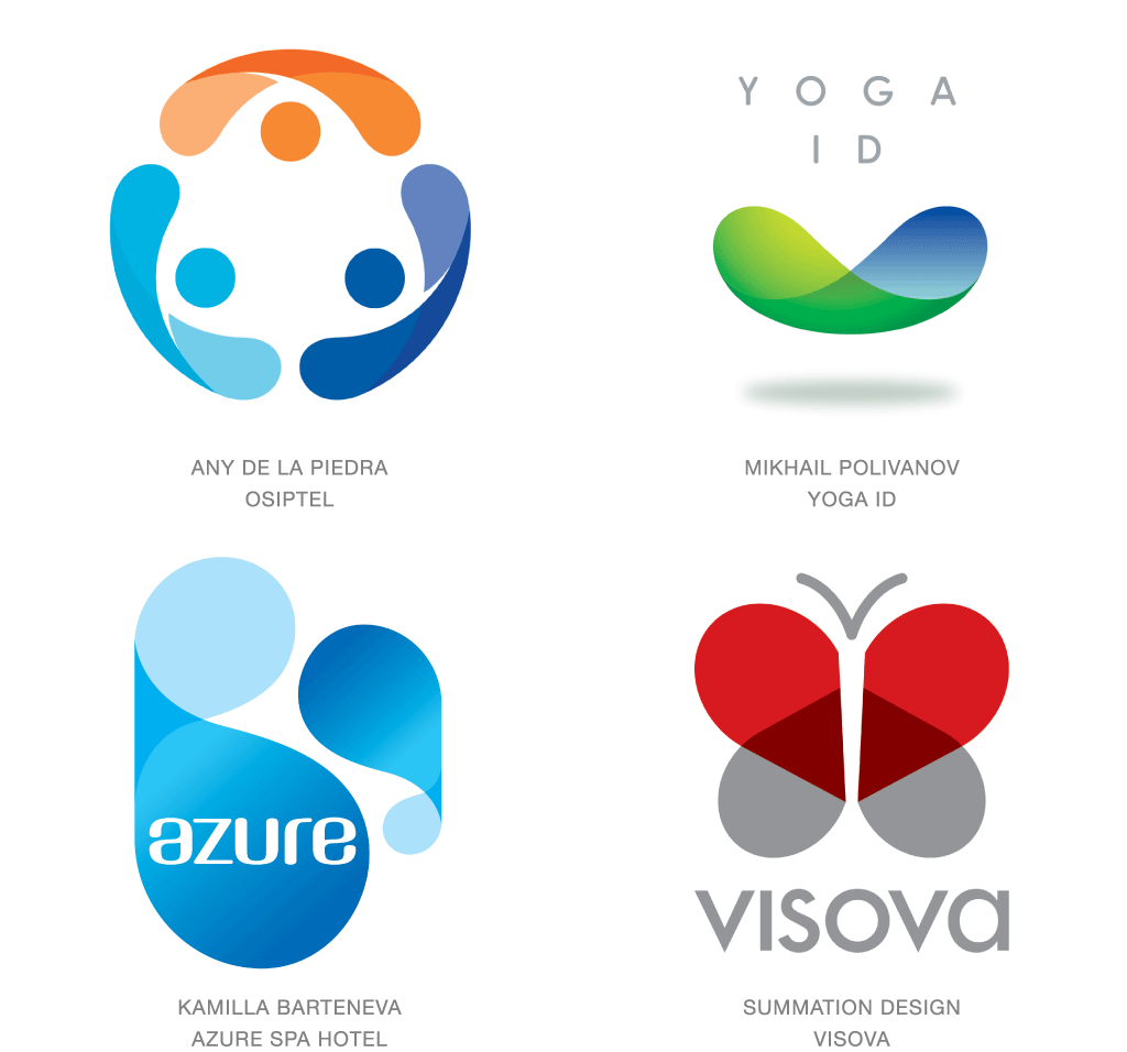
Sometimes a visual building block debuts and in short order it’s been cast with top billing in too many productions to enumerate. Descriptive words for this element appear elusive at first blush. A transparent racetrack oval left in the oven just long enough to curl up on the edges and the ends with a twist. Frankly it’s somewhere between a Fritos Scoops and a feminine liner, but with much more potential. It’s a pleasant shape to be sure, but its function is less than evident. String a few of these together around a central axis and you hint at a pretty good sphere.
Transparency seems to be a fairly common aspect of this shape but it’s not uncommon to see it achieved in flat tone, as well as with dimensional gradation and highlights. The curving form hints at a pair of arms giving an embrace or raised up to the sky. They demonstrate flexibility but with a suggested tension. Typically the inside of the shape is different from the outside, though these appear equally successful with a tone-on-tone variance. For now, these mostly offer up an engaging visual shape to serve as the replacement for another less stimulating one. Sometimes looks alone are enough to garner that starring role.
Pocket Shield
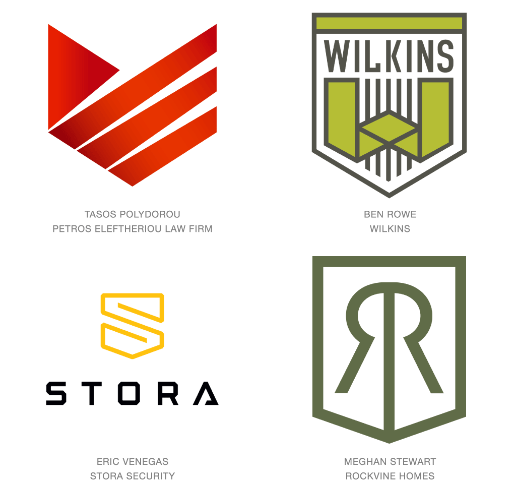
Shields have been a tried and true component of identification for as long as … well, as long as there have been shields. They demonstrate protection, authority, and are the assurance of one’s official capacity. They hearken back to kingdoms, fiefdoms, freedoms and any other “doms” with a legacy worth the battle. Symbolism that entrenched in heritage is certainly worth application but maybe with a nuanced nod, not too beholding to the past. To that end, an abundance of pocket-shaped shields have captured the industry’s imagination.
Think shield for sure, but with straight vertical sides and no sweeping curvilinear form at the base. Instead, an efficient, clipped angle at the bottom gives the appearance of the back pocket of a pair of Levis, minus the rivet. This geometric cut reflects the past but allows the outer shape to emulate a cube from its corner, or a ribbon, or any number of additional attributes. By leaving behind much of the regalia and falderal of the past, these cleaner marks separate themselves from history, but still demonstrate the understanding of the precepts we continue to associate with a shield.
Slices
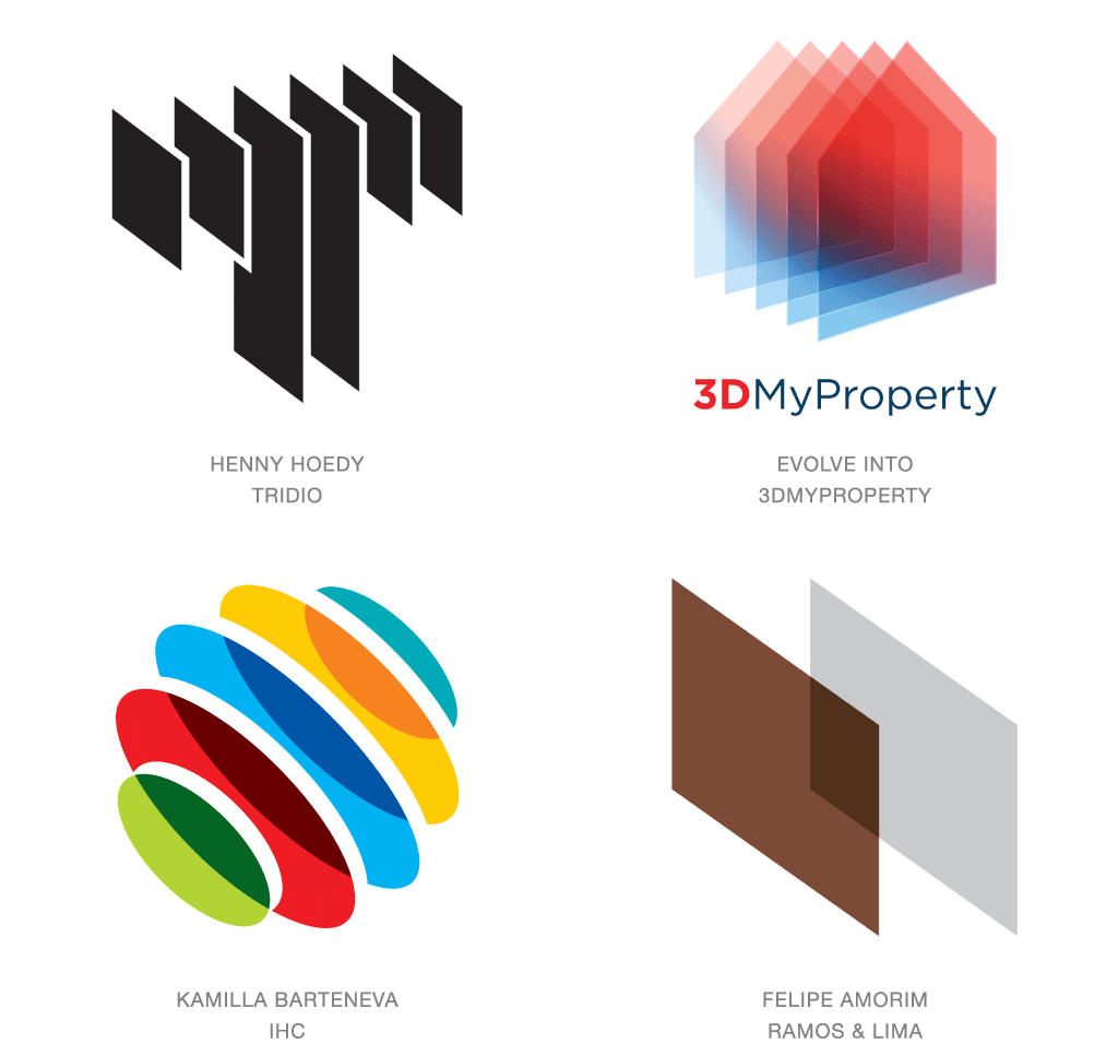
Much as a CAT Scan allows a physician to produce cross sectional views of the human body, alternately, adept designers are applying the same investigative perspective to logos. Imagine running a three dimensional logo through a bread slicer and reassembling those slices in space. Adjust for optimal perspective and you pretty much have the technique down. Of course, depending on if your slices are opaque, translucent, transparent or otherwise, the result can be an eye-popping rendition of an entity open entirely to public scrutiny.
Without relying on traditional methods, a logo is able to convey volume and transparency in a memorable fashion. These images may also conjure up the methodology of a 3D printer building thin layers of product sequentially deposited to craft an object of substance. Some of these examples may lend themselves to fewer reproduction challenges than others. This diverse group of logos relies on the same premise to create a captivating perspective that is half object, half rendering technique, but one hundred percent conceptual.
Letter Block
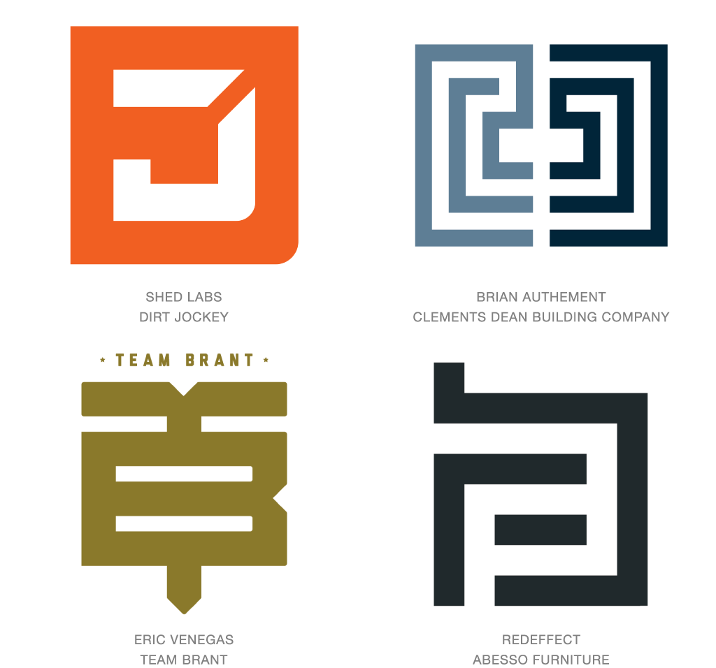
Squares and circles have a special place in the hearts of most designers. They’re relatively efficient shapes that allow us to contain an idea. The constraints of the shape are a concept the public understands so venial design sins can be forgiven if the greater good is to fit inside given geometry. Favicons favor the square logo as well, presenting the opportunity to maximize every one of the 256 potential pixels at hand. So who’s to blame a designer for trying to optimize alpha numeric characters in the skin of a square? These letter block logos have several other commonalities, including strong balance due to parity between the positive and negative spaces.
Monograms have certainly seen a resurgence of popularity but the fascination with the outer shape may be attached to the idea of turning a common letter into a useful object. Making it more iconic to give it greater weight and symbolism. These are still monograms but with strength and substance intended to reflect the individual or entity they represent.
Benders
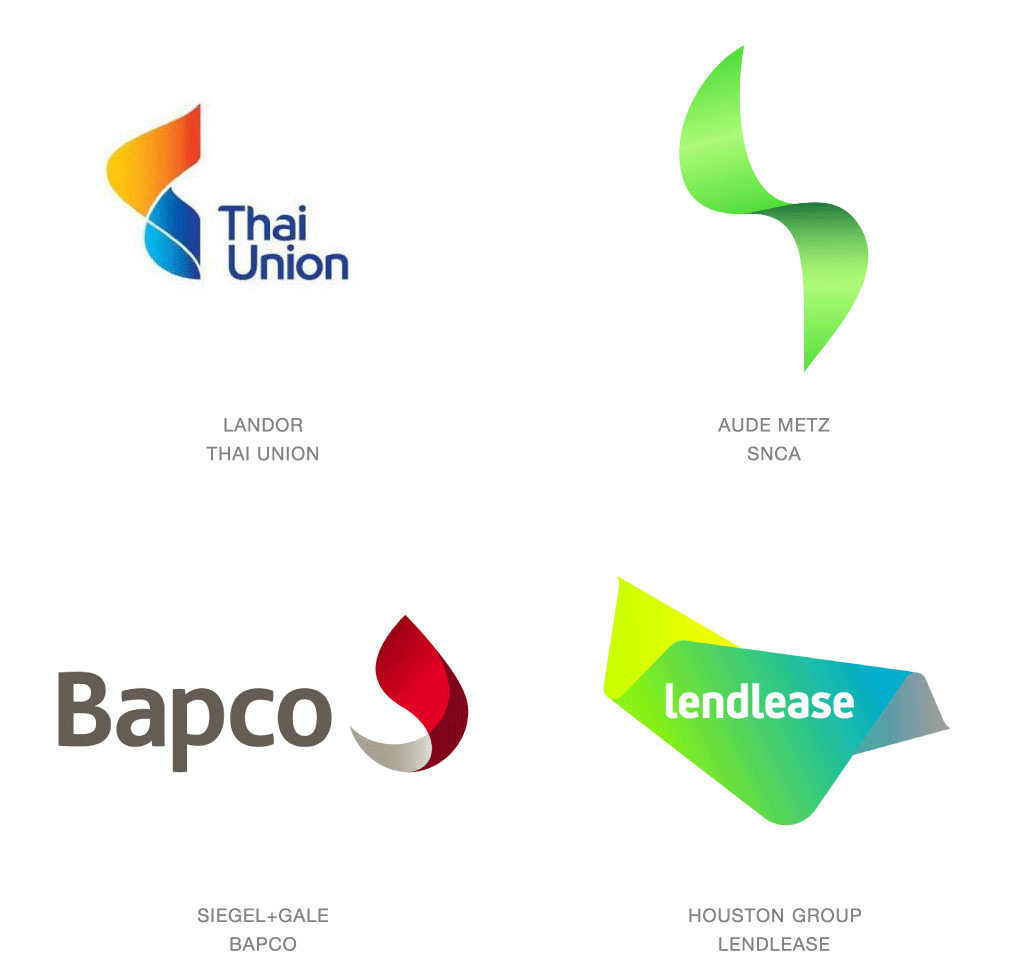
Nearly a decade following the Moving Brands iconic Swisscom logo-in-motion, a new crop of ambiguously twisted chards is taking flight. This new generation of ethereal floating symbols is still full of potential, but is every bit as conceptual as a logo can get. Don’t expect consumers to capture the essence of an industry based on a glimpse of the mark. Rather, expect the public to divine a sense of personality, or at the very least, be so captivated by the brash vagueness that they’ll be inspired to investigate further.
In fairness, any mark is supported by greater context that helps communicate a more complete story. Lendlease utilizes a continuing ribbon that undulates with additional gradient shifts to reflect the logo. Global Media Group takes advantage of the crisscrossing fluid transparencies to better display the diversity of their activities globally. The commonality they share is the desire to convey flexibility and an agile approach to their mercurial industries. These marks conceptually support a client’s ability to adjust in order to meet the demands of a market.
Bars
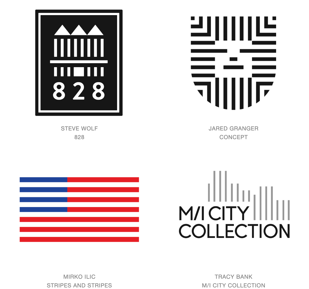
Of all the critical building blocks of design, rhythm is probably one of the most misunderstood components. There is a reason we feel comfortable with rhythm. It is the repetition of sound or movement, either simple or complex that allows us to forecast the future. It’s the repeating refrain of a song or the pattern in a textile that only requires partial consumption for you to complete what’s next.
When a logo is built with pattern, you may only need to see a part of it to imagine the balance of it. You probably only require the top bars of the American flag to guess how many more are to come, and that they will shift from red and blue to solid red as they move to the bottom. The use of the rhythmic bars allows the designer to build a transparent surface that helps the logo connect to the page and take on a sense of place. The precision of spacing and line width connotes attention to detail and consistency, which implies the same will be true of the organization the mark represents.